 Three months living in the starter home neighborhood of “Blogland” and I’ve got to move. The house is way too small for me. I need more rooms with direct access and signs on the doors that say “Home,” “About Me,” “Links,” and so on.
In the starter home, people can get into a room okay. But unless you’ve visited before, or know the secret passageways, you might get lost or stuck somewhere like in the January 28th post. The foyer entrance has a way of mysteriously disappearing, Hogwarts style.
I need a hallway like the ones I’ve seen in other peoples’ blog homes. The space on the right side of the page where I can hang up my new art work, like my blue tweety-bird and my Expert Author plaque, and my Fave this Blog button.
I need the Posts and the Comments to look clean and uncluttered, the Admin utility area to be down the hall somewhere out of view, the library of all my prized works to be organized and easy to find.
I want people to feel comfortable and uplifted when they visit. I want this home to be beautiful. So beautiful that I’ll want to hang out a lot and write inspiring things.
Welcome to how I think (all the time).
When it comes to homes and spaces, whether it be my residence or a drawer, my book or my Web site, my Blog home or Twitter home…any space where I spend time and houses me or my ideas, I’m always looking to reduce the noise and the clutter. Always looking for new ways to make a place feel good or better. Always looking for how to love it up!
So what do you think of my new place? It’s not finished yet. I’m still tweaking. But if you’d like to pipe in, I would love your input:
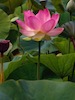
- Does my signature lotus flower work as a header? Is it too macro? Is it vibrant enough?
- Do the Posts and Comments need little separating do-dads?
- Does the title font work in terms of size and color?
- Is the Tag Cloud too busy? I kind of think it’s a cool the way some words stand out.
- Is there anything in my blog home that you think I should remove, or have?
And of course, this week’s wonder questions to play with. Ask your (spacious) self:
- Why does my home [fill in the blank] feel good?
- How does my home feel good?
- What is one thing I can do today that would make my home feel even better?

I come by way of twitter link~
I just moved over to a wordpress from blogger myself. For many of the same reasons you cited. As for appearance, I think things look well sorted out, nicely placed and inviting for us visitors.
Well done,
Rebecca
I really like the lotus flower picture as a header. It is very vibrant. You could possibly zoom it out a bit so the top petals are not clipped off.
I like the color of your title font, though personally I am not a fan of any font with serifs.
I love your blue bird!! Thank you for sharing it.
Thank you for your feedback. I agree, I think the lotus would look better zoomed out a bit…if only I could figure out how …?
Thanks also for mentioning the serif in the font. Had to Google it ’cause I didn’t know what that was. If you’re reading this and don’t know either, it’s those tiny, almost imperceptible flairs or strokes at the end of a letter. You can see some examples here: http://en.wikipedia.org/wiki/Serif.
I agree, I don’t like serif font either. I couldn’t figure out what bugs me about the title font, now I know!!
Thanks again. Big help!
the flower: it is a bit overused in terms of spiritual growth, and a bit too much of a closeup, the blog reads well, easy to navigate, way better than blogger or tumblr. Eventually, you may want your own “house” blog, similar to Annie Lennox http://www.annielennox.com/ It doesn’t have to be this elaborate, or cost 1M, but the idea can be easily “borrowed”. I think you may also benefit from some video blogging, short, to-the-point just a few minutes per day messages, so people can connect with the whole “space” philosophy, etc. I personally would prefer that to a newsletter, I am sure you understand what I mean. Thanks for the spacework anyway, our planet needs it.
Best,
AG, the winemaking artist and a space traveler
There is a great free photo editing program called The Gimp (funny name I know).
http://www.gimp.org
You can adjust your banner image with this program. The operative tool will be the rectange select, and then you will need to pull down “Image > Crop to Selection”. You may also want/need to adjust “Image > Canvas Size” and “Image > Scale Image”. The Gimp is an amazing program and there are a lot of online tutorials for it. If you can put time into learning, the sky’s the limit.
http://www.gimp.org/tutorials
Love this, Becca. Thank you!! I’m definitely going to look into it. If I had my druthers (and the tutorials aren’t too difficult) I would much prefer to zoom out the lotus flower header to capture more of its beauty. Stay tuned.
Cheers, Stephanie
I know nothing about doing this kind of stuff on a computer except that it takes a long time. My daughter made my website and I love it. I think your web home is just lovely and I would spend way too much time here if I had it to spend. You are doing just splendidly.